
Behind the Scenes: Visualising the Future of Sickle Cell Treatment for Scientific American

We recently had the opportunity to create a 4-page feature spread for Scientific American, visualising the evolution of treatment for sickle cell disease.
Now Medical Studios's Stack is a reader-supported publication. To receive new posts and support my work, consider becoming a free or paid subscriber.
This was an exciting and meaningful assignment, not just because of the topic, a rare disease entering a new era thanks to advances in gene therapy, but also because of the format. A four-page layout gave us room to build a cohesive visual narrative, guiding readers through the history, biology, and breakthroughs in sickle cell care.
In this post, we’re taking you behind the scenes of our design process, how we structured the spreads, chose what to show (and what to leave out), and worked closely with Scientific American’s team to bring the visuals to life.
Big thanks to Jen Christiansen, Scientific American’s art director and concept lead, whose direction helped shape the story from start to finish.
Step 1: Laying the Groundwork - Research and Understanding
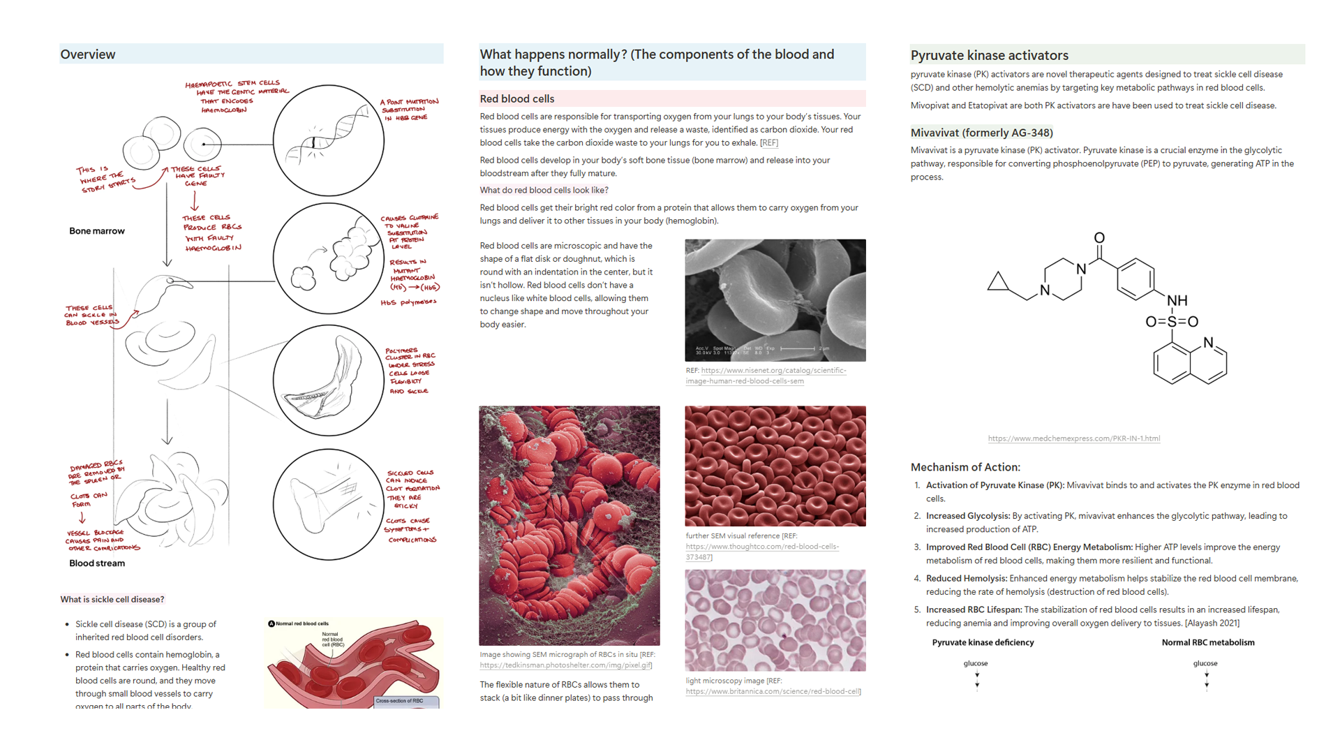
Before we picked up a pencil, we dove deep into the article to understand the key takeaways. What message did the editors want the reader to walk away with? Which parts of the science needed the most visual support? As always, Jen Christansen provided us with an excellent creative brief that highlighted these priorities and helped anchor the story visually.
As with any medical illustration project, our process began with research, led by our in-house lead researcher and medical illustrator, Angela Douglass. Angela gathered the most relevant information from the materials shared by Jen and the article’s authors, and also looked further afield to deepen our understanding of the biology and treatment landscape surrounding sickle cell disease.
Her findings were distilled into research cards, bite-sized summaries organized by sub-topic, from disease mechanism to normal anatomy to gene therapy strategies. We house these in Notion so our whole team can easily access, edit, and build on the foundational knowledge throughout the production process.
This early collaboration helped us outline our understanding of the science that surrounds this topic, breaking down complex science into digestible, information to quickly onboard ourselves for the next stage of production.

Step 2: Understanding Our Canvas Constraints

With projects like these, we’re usually given an indication of the space we’ll be illustrating, how many panels, what size, and how the layout flows across the pages. That early information is crucial. It helps us understand the parameters we’re working within and ensures that we can fit each part of the visual story into the allocated space without overcrowding, or missing important moments.
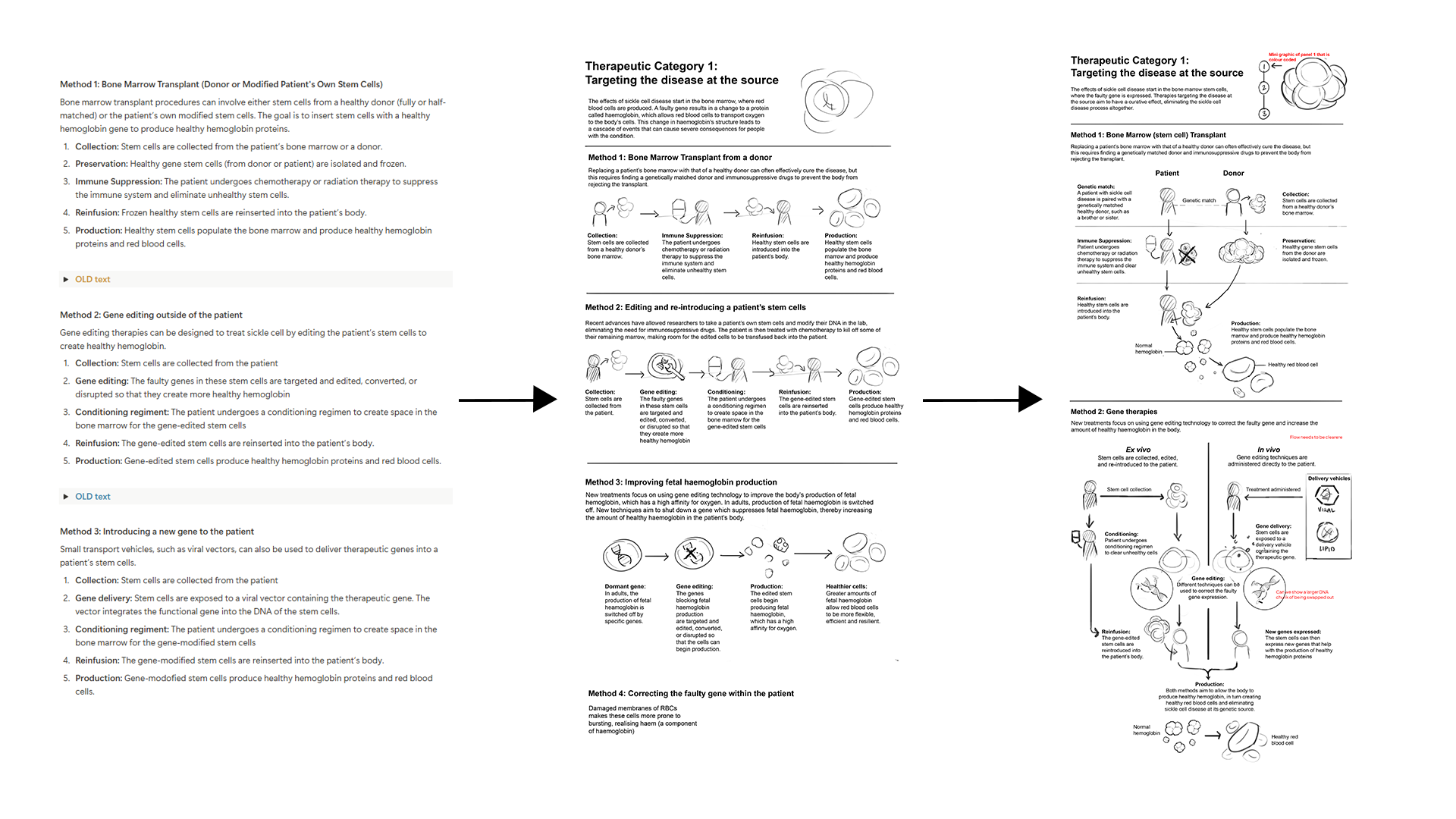
Step 3: Planning the Panel Graphics
Once we’ve digested the research and know our layout parameters, we begin planning the panel graphics.
We always start by establishing the science story first, what are we trying to explain, and in what sequence? At this stage, we write out rough label text for each panel. These are usually refined later by a Sci Am copywriter, but even early on, having draft labels helps communicate our ideas clearly and quickly, especially when timelines are tight.
In parallel, we begin mapping out what visuals we want to create for each part of the story (see text in blue in the image below). This step is crucial, it stops us from jumping straight into “pretty pictures” and forces us to think critically about what’s most important to show, and how best to show it. Each visual choice needs to support the science and narrative, not just fill space.

We take this opportunity to challenge ourselves by asking what’s truly necessary to include, and what can be left out. This focused approach saves us a lot of drawing time and helps decisions come together quickly and efficiently.
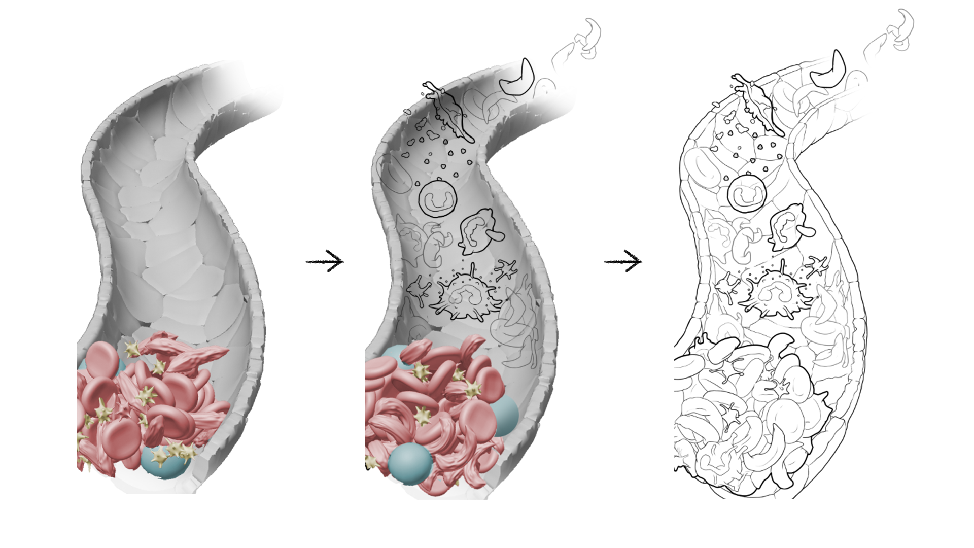
Step 4: Concept sketches
By this point, only a few days have passed, but we’ve laid a solid foundation and a clear plan of action. Our medical illustration team can now get to work sketching rough concepts tailored to each panel.

We create semi-rough black-and-white sketches, keeping all elements on separate layers to allow easy adjustments and rearrangements as needed.

Don’t be fooled by these final concept layouts, behind the scenes, we explore many different options. Thanks to our careful preparation and well-organized files, our team can iterate quickly and experiment with various layouts until we find the one that works best.
Step 5 Tight black and white sketches and locking in the layout
At this stage, we send the concept sketches to Jen and her team for review. Feedback from Jen or the authors often helps refine our direction, and we use these notes to tighten up the sketches. Here, our focus shifts to the illustrative design of the visuals, solving challenges around size, shape, and silhouette.
Sometimes, we’ll use extra tools to speed up problem-solving. For example, in this project Angela D created a 3D blood vessel cross-section. This gave us a reliable structure to work from and made it easier to draw a vessel background at a tricky angle. Since we only have a day or two to complete this stage, using the right tools helps us work effectively and quickly.
Once everything is drawn and in place, we send the sketches off for layout approval. This sign-off is the green light to move into full colour development. At this point, the layout is locked, and the focus shifts entirely to refining the final look.
Here’s what those approved layouts looked like:

Step 6: Final full colour vector illustrations
By this stage, the science story, layout, and all key visual assets have already been approved. That means there isn’t much heavy lifting or problem solving left to do. Instead, our team can shift focus to polish and colour, selecting brand colours, refining details, and making sure everything feels cohesive.
This step-by-step production process might seem a bit overkill from the outside, but in practice, it’s what allows us to juggle multiple problem-solving factors without losing momentum. It keeps us, our team, and our reviewers from feeling overwhelmed by the volume of content that needs to be created, refined, and approved.
With the story and layout locked, we finally have the headspace to focus on colour choices, deciding how to represent the pathology, the drugs, and the supporting characters. Contrast is especially important here. Too much and the scene feels cluttered; too little and readers may miss the key points in the science story.
To strike the right balance, we adjust line weights and play with opacity, subtly pushing and pulling characters within the scene so the most important elements stand out without overwhelming the viewer.

We work in Adobe Illustrator, tracing over our tight sketches to build the final artwork. At this stage, our priority is organization: every element is separated, labelled, and kept flexible so it can be moved or adjusted easily. That way, if the Scientific American team requests last-minute edits, we can make them quickly without disrupting the entire illustration.
Until Next Time
That’s a wrap on this behind-the-scenes look at how we build layouts for Scientific American. We hope you enjoyed this deep dive into our process. If you’d like to see more posts like this, or have ideas for future topics you’d love us to unpack, check out our Substack!