
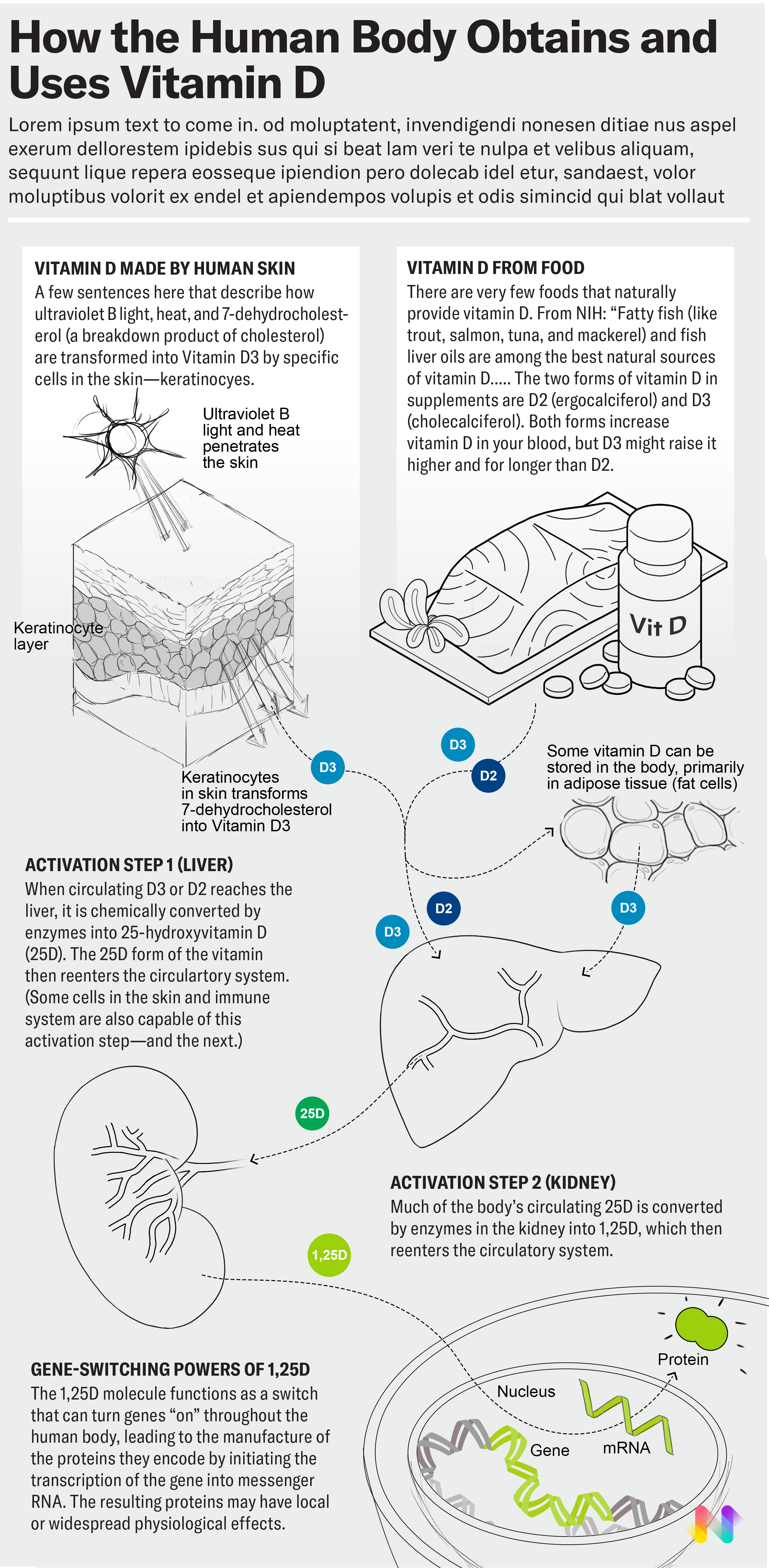
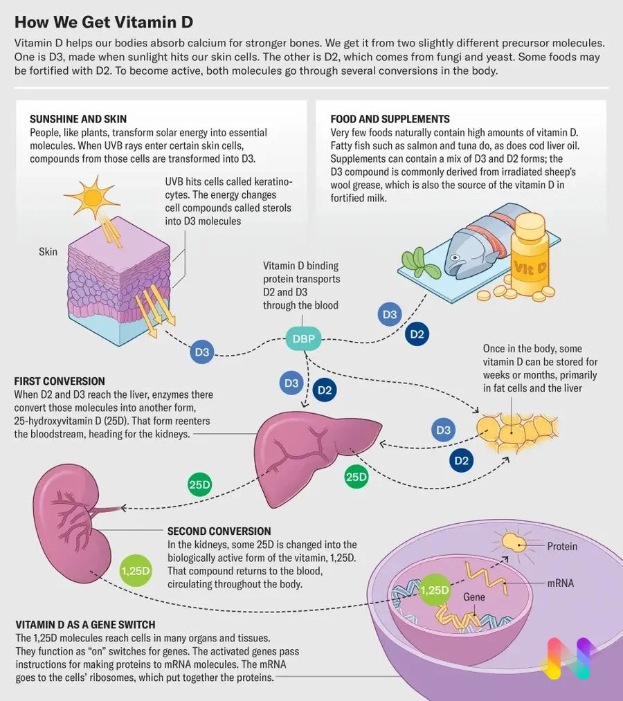
Scientific American: How we created the vitamin D infographic

Not all projects we do require us to create everything from scratch. Sometimes, our client may provide us a concept map to start with. It is the initial blueprint of what they envision, filled with text boxes and graphic descriptions that are crucial to understanding the concept.
In this case study, we will show you how we execute a client's vision, using a project with Scientific American as our example. The concept map was created by Jen Christiansen, Scientific American’s art director and concept lead. You will see how our in-house researcher and medical illustrator, Angela Yeung, brought forward the concept map provided, turning initial research to the final visuals.
👉 Read the full Scientific American article here
[For a deeper look at our process on start-from-scratch projects, we also have an extended article on how we created a four-page feature without a provided concept map.]
Step 1: Analyse the client’s concept map
A concept map is more than just a quick sketch. It is a roadmap to understand the client's vision and become their collaborator, not just a production artist.
The sketch here outlines a linear story: the journey of vitamin D from intake through the skin and food, to its processing within the body's organs and a final genetic change. Keeping this story and its key players in mind throughout the entire process is essential for creating an impactful graphic.
We also have to consider the target audience. A broad readership like Scientific American's requires a simplified, accessible representation, whereas if your audience were medical professionals, the graphic would need more technical detail.
As you analyse the map, a list of research questions, specific to the graphic you have to create, should naturally emerge.

Step 2: Research
A common pitfall for beginners is getting lost in a sea of complex scientific information. To avoid this, remember that your research is best guided by the client's initial vision and their concept map. The map determines whether you need to do broad, exploratory research or targeted, focused research.
Broad Research and Filtering
Sometimes, what is shown in the concept map is more open-ended, and a broad research has to be done first to secure an accurate representation.
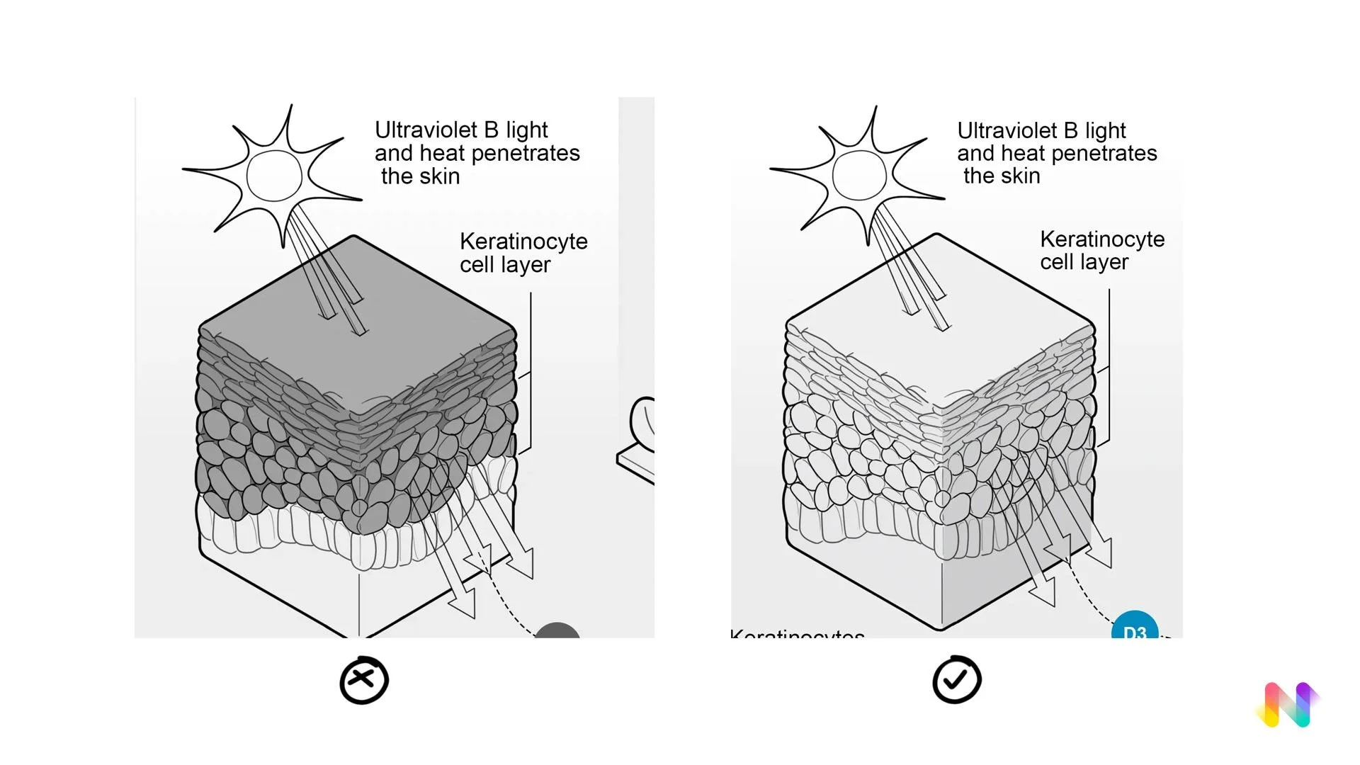
Take the skin pathway as an example, the map asked for a skin schematic where UV enters and converts, but it doesn't specify which layer. Start with researching the entire cross-section of the skin helps you understand how its layers work. A broader search gives you the context needed to accurately identify and filter out the single detail you have to highlight: the keratinocyte, the layer responsible for absorbing UV light.
Your research questions might start broad and become more targeted:
How does the cross-section of skin look like?
Which layer specifically absorbs and converts UV light?
What is the size and shape of the cells in this key layer?
For context, how much detail on other skin layers is needed for an accurate but not overwhelming illustration?
Use your research to find microscopic data and understand scale. It’s okay to start with a brain dump, but always finalise it with focused sketch notes that make your key message explicit.

Targeted Research from Visual Cues
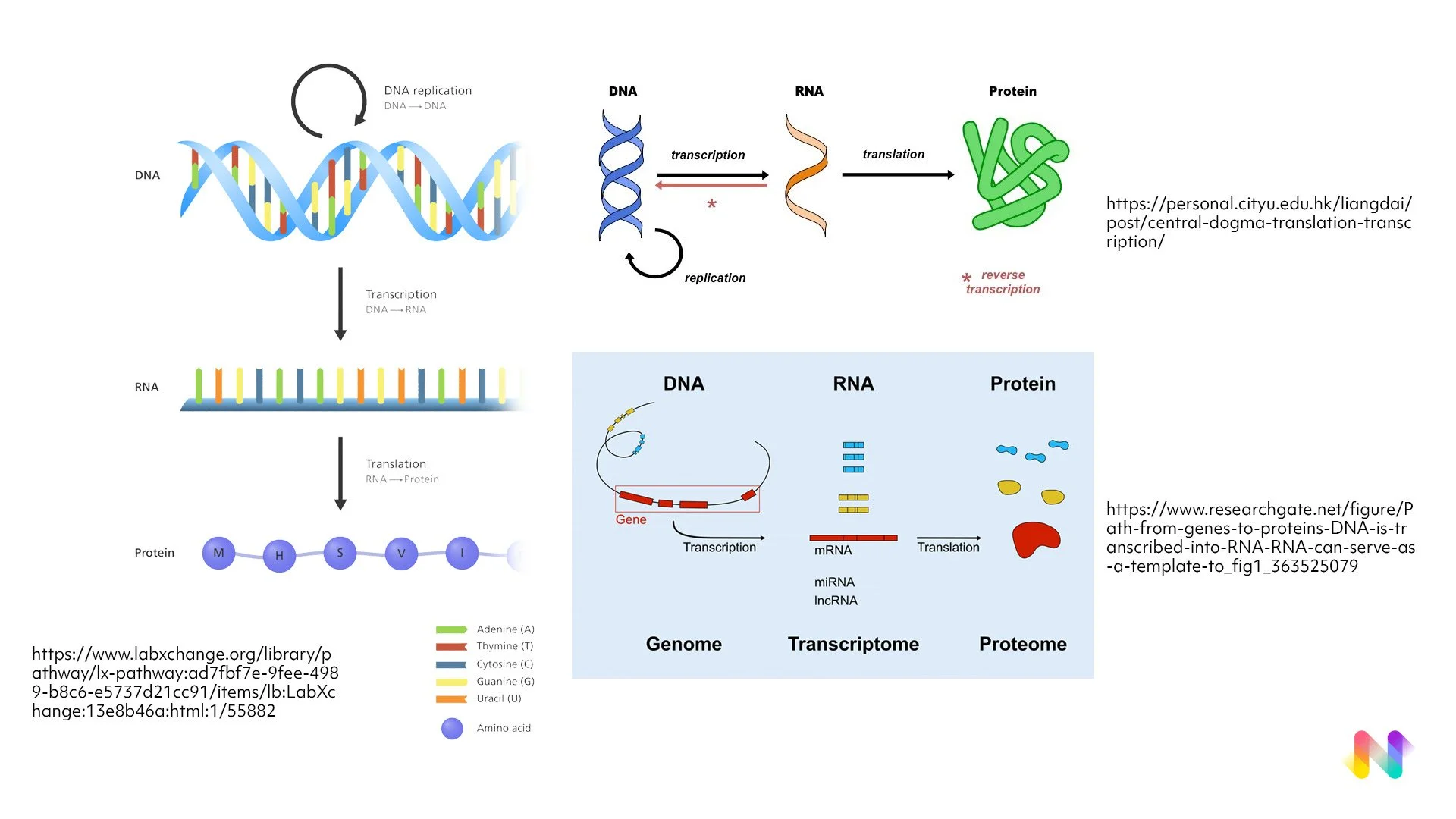
Alternatively, a concept map can provide "hints" that allow you to narrow your research from the very start. For example, if the client uses a simple circle to represent different forms of vitamin D, you can assume you can save time on figuring out the molecular structure of the key players in transcription process. Instead, focusing on market research to see how other graphics simplify concepts like DNA and proteins would be a more sensible step. This approach saves time by letting the project's visual language dictate the scope of your research.
Step 3: Concept sketch
Concept sketch is the important step of transforming your understanding into a clear visual. In this stage, critically evaluate what is truly essential for your graphic is the key. Ask yourself, ”Does this detail truly matter for the story I am telling?”
For the vitamin D infographics, since we are focusing on the keratinocyte, it should be the central focus on the illustration. While other skin layers are necessary to be added in to give a sense of texture and context, keratinocyte should be the star. Stripping away unnecessary details like the structure of the dermis layer, is the key to creating a clear and impactful visual. Good research helps filtering through information to find exactly what's needed for the final graphics.
Here is how the infographic looks like at the concept sketch stage. Take note of how the keratinocyte is highlighted and the dermis layer is left out:
Step 4: Tight sketch
For the tight sketch we are going with our usual company style: a thicker outer line and thinner inner line. In the midst of production, again it’s easy to getting lost in the weeds. That’s why we always keep a list of our creative directions handy. This simple habit of marking down creative directions keeps us on track and ensures all our final graphics stay true to the initial vision.

At this stage, we also consider the practical aspects of the design that affect both workability and legibility.
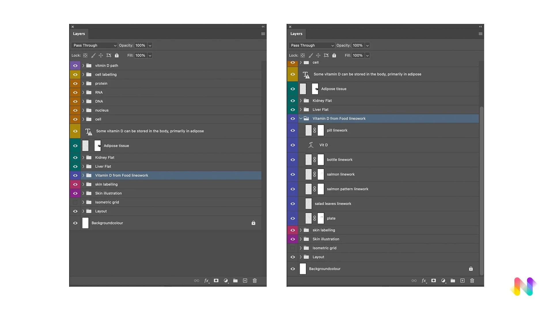
For example, to simplify future edits, each element should be drawn on its own layer and masked out. This means the salmon and the plate, pill bottle and individual pills should each be organised into separate groups. They also have to be well-labelled and grouped properly to make sure colours and shadings can be added easily at the next stage.
Additionally, we must ensure the graphic is legible at size where the graphic is printed. Tangents, where two lines meet in a way that creates an unintentional point of visual tension, has to be avoided. Consider how the image is viewed at a distance or in a smaller size is the key here.
This is how the infographic looks like at the tight sketch stage:

Step 5: Final full colour illustrations
The main consideration at this stage is colour. Scientific American infographics are known for a wide range of colour palettes in their new brand update. In order to choose the right colour, planning ahead is crucial.
Creating a colour script, which is a guide for your colour choices, is a good way to ensure a clear and consistent visual language. For this colour script you'll notice we relied heavily on colour connotations for many of our choices, such as using orange for salmon and a warm, pinkish hue for organs.

After the colour script is all set up, the final step to a high-quality illustration is to consider value shading. A common mistake for beginners is getting bogged down in unnoticeable details. Instead, it's more effective to focus on getting the tone and value right in the big picture, which create form, depth and visual interest.
Feedback and revisions are a normal part of the process, even at the later stages. For instance, a client requested a clearer representation of the salmon. At this point, you've already done the deep research and have a solid grasp of the information. This lets you quickly problem-solve and adapt without needing to spend a lot of time redoing research.

This is how the infographic is presented in the physical and online copy:
That’s a wrap on this project breakdown! We hope it gave you some insight into the care and craft behind every scene. Got questions or want more behind-the-scenes content? Drop us a comment over on our Substack!