
Targeting HIV: Mechanism of Action Visualization
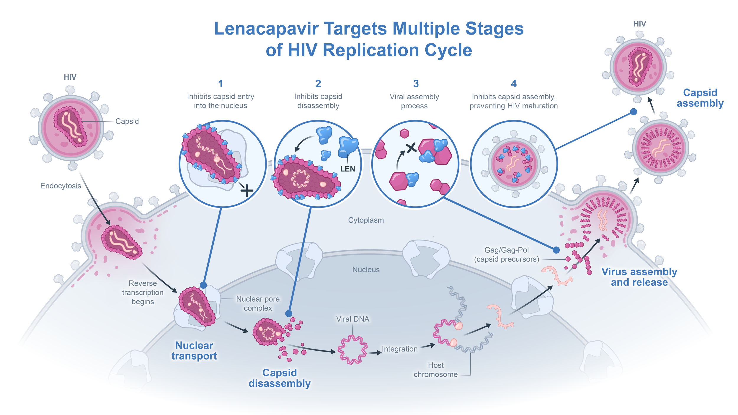
Our team created an illustration of a mechanism of action (MOA) for a client’s core presentation deck. To represent the complex sequence involved in HIV replication, we employed a clean, structured design with simplified shapes and lines. Callouts were strategically placed to direct focus to key target areas within the replication pathway, highlighting therapeutic intervention points to halt HIV progression. This approach resulted in an accessible visual tool that seamlessly integrates with the client’s presentation while enhancing their scientific narrative.
Understanding the science
First we start off with research and try to simplify the research into an easy to understand pattern. The challenge here was that there were 2 science stories to tell. Firstly we needed to introuduce the replication cycle of HIV. Secondly we needed to highlight the 4 therapeutic areas that drugs can target in this cycle.
Once we understood the science story, we could then roughly plot out the MOA in a configuration that helps us:
a. Tell the science story
b. Implement that science story into a linear design

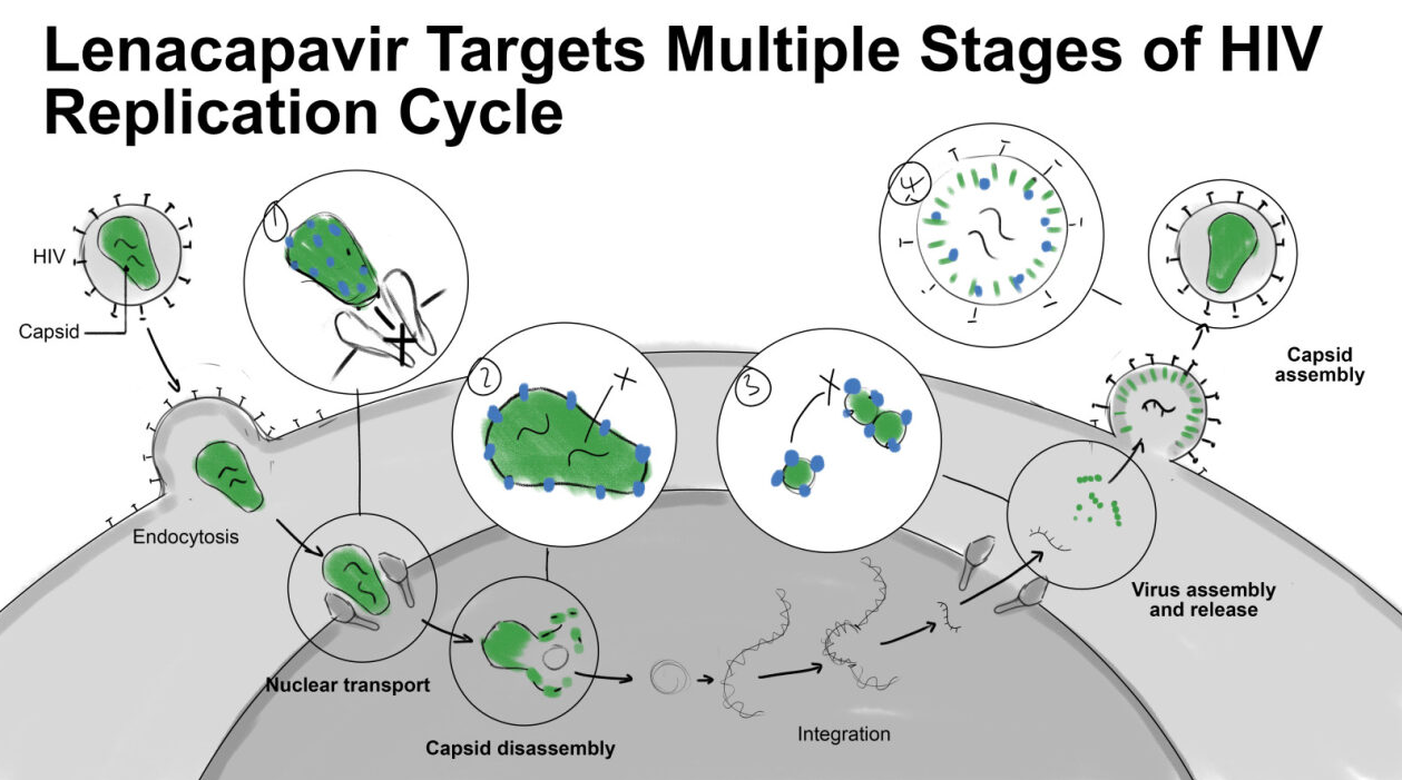
Exploring Visual Pathways
Through simplified shapes and clean design, each iteration focused on enhancing clarity and highlighting target intervention points. At this point we still found that there wasn’t a clear delineation between the HIV cycle vs the 4 therapeutic targets. The reason for this was that the 4 callout circles follows the shape of the HIV cycle too closely, making it seem like it was a magnification of what was happening in the life cycle, which is not the point of these 4 callouts.

Defining Focus and Exploring Color
Here, we began refining focal areas and testing various color schemes to support a clear information hierarchy. You’ll notice now that the 4 therapeutic targets are more distinguishable from the MOA, this is because of the way that these are placed at the same hierarchy as well as the blue colour being introduced as the key differentiator.
Once we established this delineation, we could refine the hues and values of the rest of the image. These work-in-progress images illustrate our exploration of color as a way to guide the viewer's attention to essential target areas within the illustration.
Finalizing Brand Colors and Details
In the final stages, the client had requested alternative brand colours to use. Because we focused first on information hierarchy, this mean that we were able to switch out colours without losing the science story.